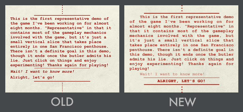
The Ben Wander Murder Collection (yes, still a tentative title) has a lot of text. Though the game has visuals — locations, characters, travel screens — the majority of a player’s time involves staring at words. My text-system was okay, but had some issues. Alleviating those issues was paramount! Here’s a semi-technical breakdown of how I did that — any questions welcome!
Next Button
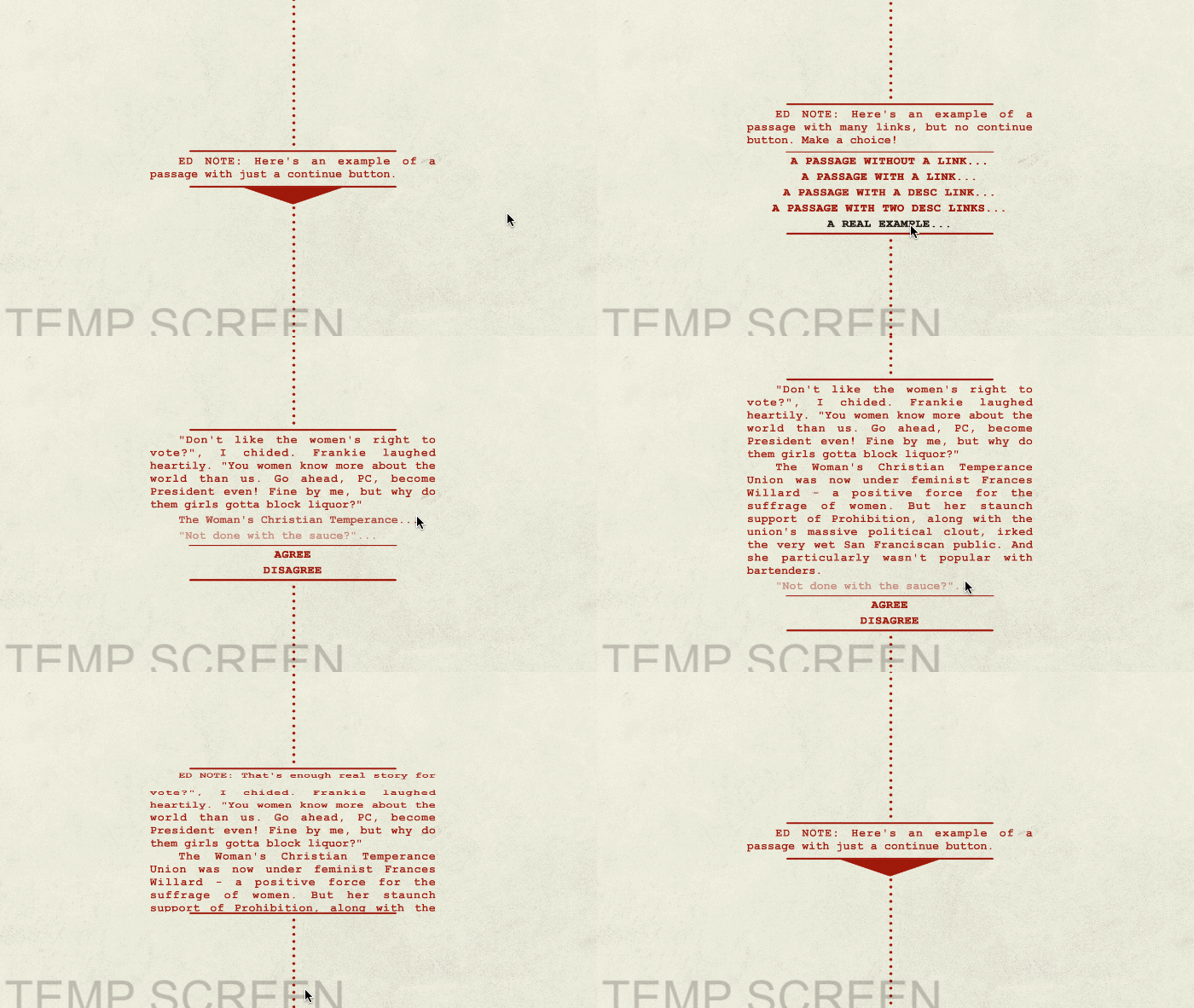
Pacing text in games is important — an entire screen of words can be daunting! I want to make sure my players never feel overwhelmed. Sometimes I had large amounts of text without any choice for the player to make — I could tell I needed to divide those. But if the player doesn’t have an action, how does she continue her journey? I give you my glorious “Next Button”:
Understandable Links
Beyond the “Next Button”, players have two ways of interacting with text. Main Links are text-buttons representing choices or actions that the player can take — e.g.: TALK, CONTRADICT, etc; if a player clicks these links, she progresses the story. Descriptive Links are text-buttons that only display more detail of the game’s world — historical facts, character backstory, etc.; those links don’t move the story forward. In the old text system, the two links were hard to differentiate. I believe the new system more clearly distinguishes between link types:
Clear Fonts
Unity’s UI text system uses bitmap fonts — which, glossing over some details, display letters clearly at a target resolution, but the letters become more blocky and blurry the further your screen deviates from that target. Enter Text Mesh Pro, a solution Dino Ignacio recommended while I crashed at his place last month. TMP uses signed distance functions (a technique first pioneered by Valve). You can nerd out on the implementation details (I may have O_o) but the basic result is that, at all resolutions, the font looks perfect. Good news — no extra draw calls or memory!
Animation
The old text animations were slow — grating my players’ patience when displaying large blocks of text. And, for a game claiming inspiration from Saul Bass, the animations seemed pretty tame. But a consequence of Text Mesh Pro’s font implementation is that I now have a rectangular mesh object per letter — i.e.: I can manipulate each letter’s position, rotation, scale, and how skewed it is. That’s powerful! As an example, I created a “roll out” animation of my text, where I rotate each line into view one at a time. Here’s that visual, with animated examples of the rest of the added features as well — and a sneak-peak at a(n in-progress) part of the story:
The Future
Now my text, and my players’ actions around that text, are more intelligible. Next up, making it fun. TMP gives me the ability to animate text in a variety of ways, and I plan to use that power to create entertaining transitions appropriate to the mood of every scene. But that’s just the text. Much more polish is required for every part of this game.
Wish me luck!


Comments
2 responses to “Technical Text”
Hey Ben, the next button just kind of disappears… intentional?
After watching the GIF for ten times, I can conclude I’m not insane! The Continue Button doesn’t disappear instantly, it instead slides up behind the text (there’s a mask there to hide the button so the animation looks smooth).
But it does hide! Why? Because certain passages don’t have a Continue option — they require a choice. “AGREE” or “DISAGREE” is in the above example. There’s a character waiting for a response, and you have to pick from options. You can’t just “Continue” without saying anything.